Looking Into The Valley
This personal project was created to symbolize the vastness and unpredictability of one's future by capturing the fogginess of the landscape the subject is looking toward. I was able to emulate space in this piece by carefully positioning the character in the foreground, and being careful not to cover too much of the landscape. This piece was accepted into Saugus High School's 28th annual Literary Magazine - The Centinel (Pg. 32).
Tools Used:
- Clip Studio Paint Pro
- Wacom Drawing Tablet
- Samsung Galaxy S23 Front Facing Camera
Client Work
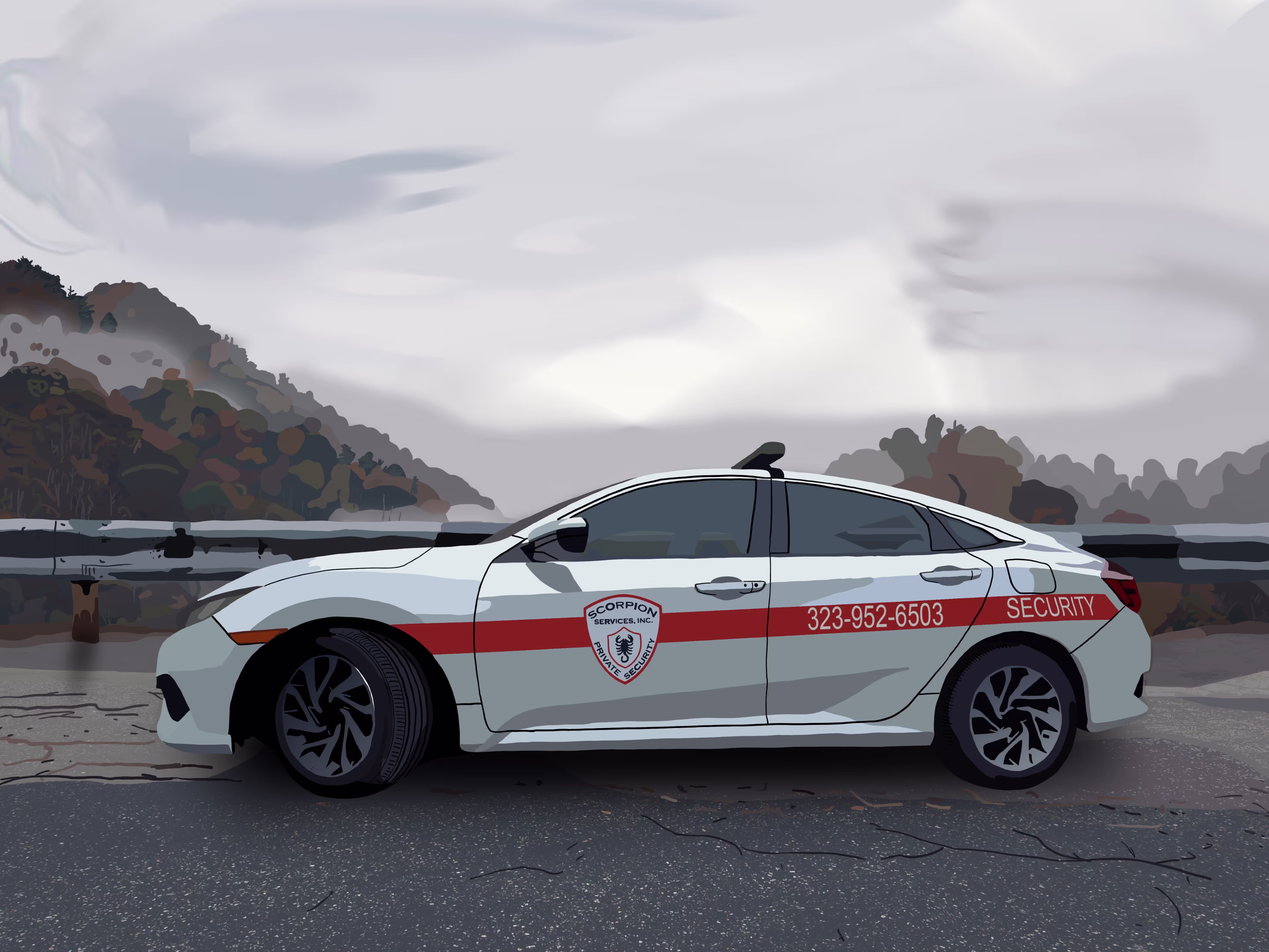
Client: Moti
Commission - Digital artwork of company car | printed on canvas
I took a photo of one of Scorpion Services' patrol cars, and made a digital illustration of the car using Adobe Photoshop and a Wacom Drawing Tablet. I achieved the texture on the road by merging both the original photo and a flat grey color blended together using Photoshop's blending modes. I also achieved a sense of depth between the foreground and background by adding a rail above the street the car is on.
Tools Used:
- Wacom Drawing Tablet
- Samsung Galaxy S23 Front Facing Camera
- Adobe Photoshop
Client: Verina
Commission: Digital Illustration of pet | printed on canvas
A picture of Verina's pet was taken and shared with me, and I was tasked with making it into an illustration. I achieved this goal in Adobe Illustrator, utilizing the pen tool to illustrate the details of the image.
Tool Used:
- Adobe Illustrator
.avif)
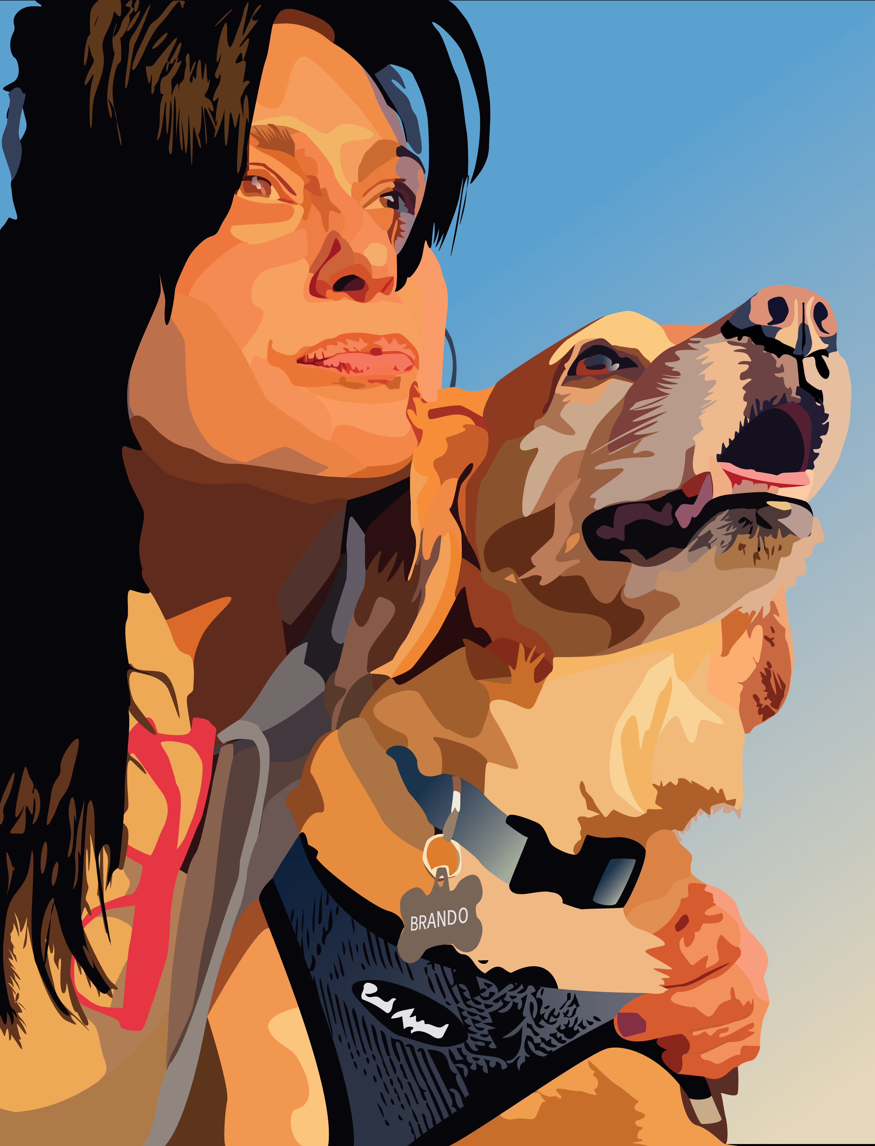
Client: Verina
Commission: Digital Illustration of pet + her portrait | printed on canvas
A picture of Verina and her dog was sent to me, and I was commissioned to digitally illustrate it.
Tool Used:
- Adobe Illustrator
Personal Works
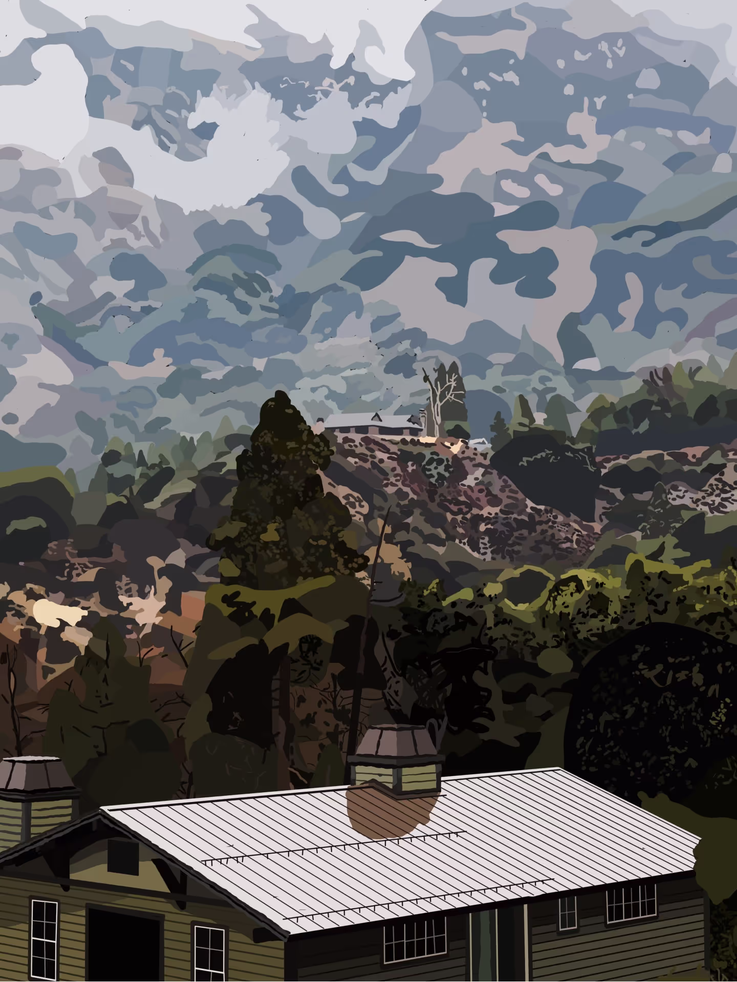
God's Glorious Craftsmanship
This personal project is tied to Looking Into The Valley, with another picture taken from Forest Home Christian Camp. I wanted to capture God's craftsmanship of the landscape I witnessed during my time there. This piece was accepted into Saugus High School's 28th annual Literary Magazine - The Centinel (Pg. 118).
Tools Used:
- Clip Studio Paint Pro
- Wacom Drawing Tablet
- Samsung Galaxy S23 Front Facing Camera
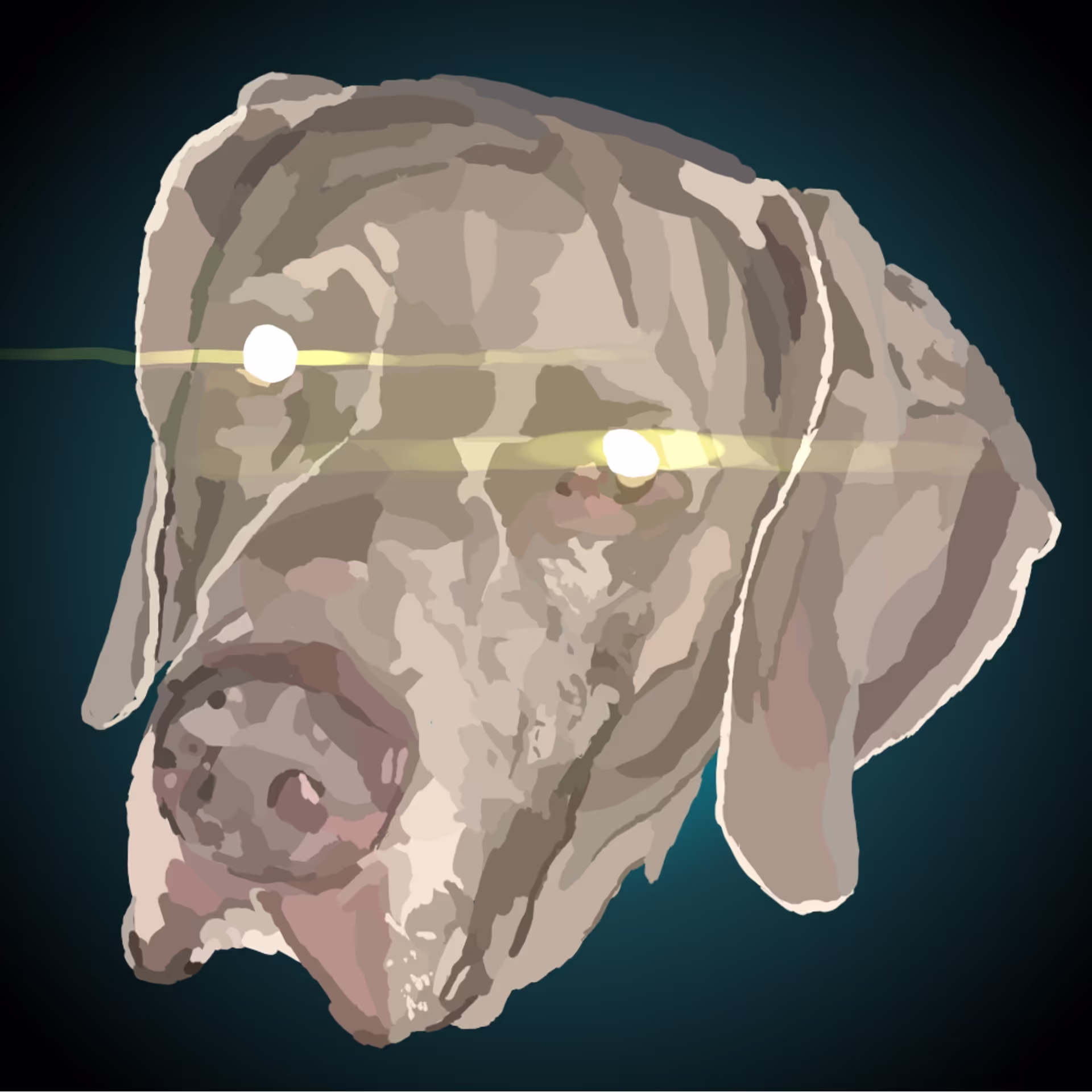
Pets! - Maverick
This personal project was for my friend Mathew, who I offered to make artwork of his dog Maverick. I used my own art style for this project, and included the glare from his phone camera to add an extra effect into the piece.
Tools Used:
- Clip Studio Paint Pro
- Wacom Drawing Tablet
Self Portrait 2
I was not completely satisfied with my initial attempt at a self portrait in Adobe Illustrator, so I took another photo, with different lighting, and used a different program. I used Clip Studio Paint Pro and a Wacom Drawing Tablet to remaster that class project. I made the colors in the background more vibrant in this one to emphesize myself further.
Tools Used:
- Clip Studio Paint Pro
- Wacom Drawing Tablet
- Samsung Galaxy S23 Front Facing Camera
- Kodiak® Kraken Rechargeable 6000 Lumen Tactical Grade Flashlight
My Education:
Digital Media Arts | Year One
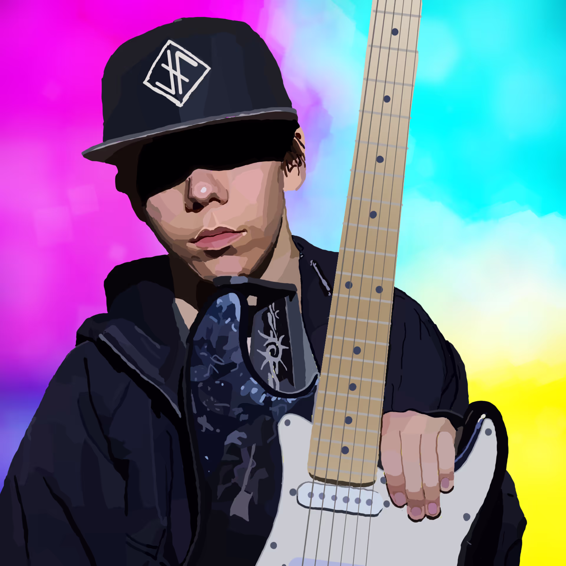
Klimt Project
The goal of this project was to choose a person, and make a design over them, emulating Gustav Klimt's art style. I chose my favorite musician - Jordan Feliz - for this project. I used Photoshop to make this image and used a multitude of brush sizes, and transparencies to add the neon-lights in the background. I used symmetry to put more focus on Feliz, and utilized many different values in the highlights in the background to emulate neon lights. I used two colors for the background to further highlight the lighting in Feliz's initial photo he took.
Tools Used:
- Wacom Drawing Tablet
- Samsung Galaxy S23 Front Facing Camera
- Adobe Photoshop

Action Typography Assignment
This first year digital arts project required me to use a photo of me to create typography that describes my personality. I used Photoshop to make this piece, and used a GoPro Hero 5 to take a photo of me. The use of flow and form that my image uses helps bring the image to life, by highlighting myself over the dark background. The typography was used to mask the background of this photo, making myself the focal point of the piece.
Tools Used:
- GoPro Hero 5
- Wacom Drawing Tablet
- Adobe Photoshop

Vines Project (Hermaeus Mora - Elder Scrolls V Skyrim)
This project required us to make a series of writhing, twisting vines that overlap each other throughout the entirety of the piece, with spheres in between many of these vines. I decided to choose one of Elder Scrolls V - Skyrim's daedric prince Hermaeus Mora for this project as I am a fan of the franchise.
Tools Used:
- Wacom Drawing Tablet
- Adobe Photoshop

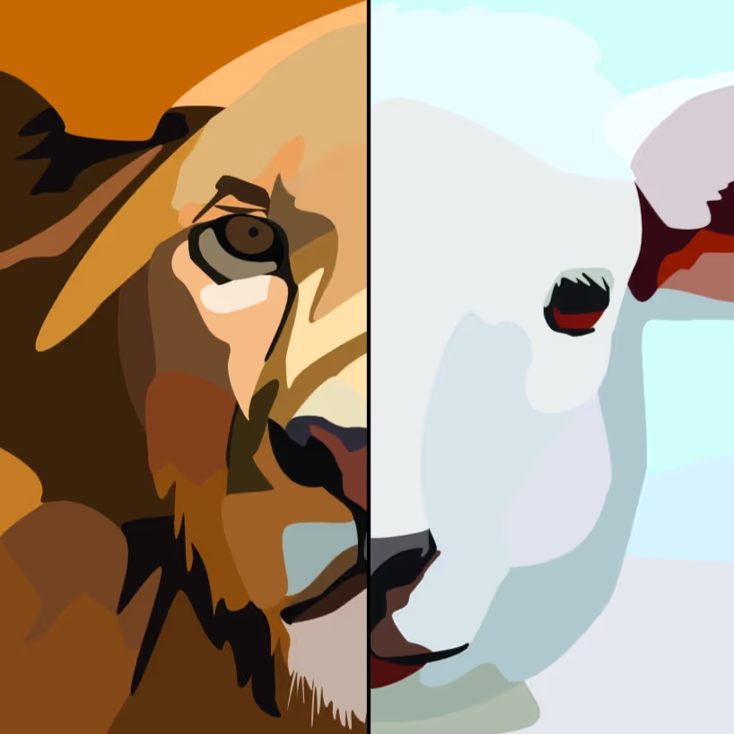
Hybrid Animal Project
This project required me to blend together at least 4 different animals and turn them into one creature. I made this with photoshop, and used different masks to hide the excess parts of each animal. The elements of art used to make this piece successful are detail between the different animal parts, color making it seem like it's supposed to be one animal, and form, where you can see the shape of the animal and how its supposed to look.
Tools Used:
- Adobe Photoshop

Digital Media Arts | Year Two
Animation
Jesus is Coming Back - Jordan Feliz (Rotoscoping Assignment)
This school project required me to individually draw a minimum of 150 frames of a video of our choosing. The rotating background was created using the rotate tool, rotating a design previously made by 1° each frame, then adding a drop-shadow to the drawings of the singer and guitar player. The second art style was achieved by duplicating the outlines of both the singer and guitar player, and the text in the background twice, and morphing them using the (spherize) option in Adobe Photoshop. The contrast created utilizing value between the semi-realistic drawings of Jordan Feliz and the bright background emphasize him in the video, and the contrast between the white text and drawings and the black background also emphasizes the focus of the rotoscoping. This contrast also emphasizes the positive and negative space, separating the background from the subject. The shading by utilizing a semi-realistic art style for the first art-style emphasizes the form seen in the original video; to highlight his appearance during his concert. I chose to use this clip from a concert I went to because I wanted to create something to express my faith in Jesus, and because this artist is my favorite musician.
Tools Used:
- Adobe Photoshop
- Wacom Drawing Tablet
- Samsung Galaxy S23 Front Facing Camera
Walk Cycle Animation
This school project challenged us to create a walk cycle. The class traced two different walk-cycles, then created characters to animate over the walk cycle. We used Photoshop to draw each frame of this animation, and later drew the background to scroll along with the character. We used Photoshop's timeline to time our frames to determine the speed of the animation, and used keyframes to move the background along separately behind the character. I utilized many different default brushes in Photoshop to achieve the textures in every part of the background, and to emulate a somewhat realistic look to the background. The characters simplicity and contrast from the background is supposed to emulate a sense of space, alongside the different colors in the background implying different aspects of the landscape. The character's head and hands are spheres, to simplify the process of animation. The body and details are all organic shapes to emulate the appearance of someone wearing motorcycle gear.
Tools Used:
- Adobe Photoshop
- Wacom Drawing Tablet

Falling Leaf Animation
This class project from my second year of Digital Media Arts class at Saugus High School required us to create an animation of a leaf falling, either from the sky or from a tree. We used Adobe Photoshop's timeline to animate the leaf's movement down. I used long brush strokes to create the tree and the ground, attempting to emulate a hill, creating the illusion of space in the animation. I switched the color of the leaf every time it switched direction to capture the value of the leaf, to emulate the effect of the leaf turning over each time it switches directions. The tree captures the space in the animation, determining where the midground of the animation is.
Tools Used:
- Adobe Photoshop
- Wacom Drawing Tablet

Graphic Design
SkillsUSA 2024 Pin Design Contest
This school project required us to enter a contest for a pin or a t-shirt design for SkillsUSA's 2024 merchandise. I decided to design a pin themed around the California license plate. I added value to my pin design by utilizing a drop shadow behind every element of the pin to emulate depth in the piece. The depth added to this piece builds on the illusion of space in the piece, making the license plate look three-dimensional. The use of negative space behind the text "SKILLSUSA" is utilized to make the text easy to read. I also used SkillsUSA's color scheme to highlight that this pin would belong to SkillsUSA.
Tool Used:
- Adobe Illustrator - Pen Tool & Text Tool
Digital Artwork
Thaddeus the Destroyer's Ascension
(Character Turn Around & Environment Project)
This is a school project from my second year in high school Digital Media Arts class. The objective of this assignment was to create an original character with a detailed background and biography, then to create a front, side, and back view of the character, and to draw a background for the character. I utilized the Unreal Editor for Fortnite to create a base for the background to then draw over for proper perspective and lighting. I drew the background with both Clip Studio Paint Pro, and Adobe Photoshop to add special effects and to add interesting value and depth into the piece. The Unreal Editor for Fortnite helped me to accurately capture the form, and space of the background, in order to make the background convincing. I used blending modes in Photoshop to add texture to my artwork, as the base drawing I created was flat, only utilizing organic shapes.
Tools Used:
- Unreal Editor for Fortnite (UEFN)
- Clip Studio Paint Pro
- Adobe Photoshop
- Wacom Drawing Tablet
.avif)
.avif)
.avif)
Pets! - Tippy (Polygonal Animal Project)
This is a school project from my second year of Digital Media Arts high school class. The objective of the assignment was to use at least 200 polygons to re-create a photo of an animal. I used exactly 1155 geometric shapes in this project. I chose my dog Tippy for this assignment. I used the eyedropper tool in Adobe Illustrator to capture the value in the photo I initially took, which emphasizes the space the artwork highlights. I gave this the illusion of depth by using value, darker colors around the bottom of the polygonal animals face to make my dog look 3d. I applied space by using up most of the artboard leaving very little negative space.
Tools Used:
- Adobe Illustrator
- Samsung Galaxy S23 Front Facing Camera

Self Portrait 1
This project is an assignment from my second year of my high school Digital Media Arts class. This project required me to use at least 50 different shapes using Adobe Illustrator's pen tool to re-create a portrait of a person. I chose myself for this assignment as I wanted to attempt to create a self-portrait. I made sure to keep the value in the piece with my variety of colors I took from the initial photo to emulate the space the photo creates. The background consists of three of my favorite colors, and it helps add emphasis on my self-portrait. My use of organic shapes helped emphasize the structure of my face and clothing. This project also required us to have a minimum of four color values to break up the shapes, which also helped exaggerate the details in my portrait.
Tools Used:
- Adobe Illustrator
- Samsung Galaxy S23 Front Facing Camera

Saugus High School 2024-25 School Year Student Planner Contest
Saugus High School's Digital Media Arts Two class designs the student planner each year, and this was my submission. I took a picture of the centurion statue in the school, then illustrated the statue in the colors of Saugus High School. I used darker blues taken from the school's color scheme for shadows, and lighter blues for the highlights. The monochromatic color scheme creates balance throughout the piece, making the piece easy to look at.
Tools Used:
- Adobe Illustrator
- Samsung Galaxy S23 Front Facing Camera

Digital Media Arts
Year Three
Independent Study Project #3:
Oopy Goopy Serif
I chose to create a font for this project, opting to go for a stylized serif font. I chose this style of font because I really like how many serif fonts look, especially bolder ones. I utilized organic shapes for my font to create a soft look to them. I also made sure the entire font was in proportion with itself, as to not make any letters or numbers look off compared to the rest of the font.
Tools Used:
- Caligraphr
- Adobe Photoshop
- Wacom Drawing Tablet
Characters In Font:
1 2 3 4 5 6 7 8 9 0
Aa Bb Cc Dd Ee Ff Gg Hh Ii Jj Kk Ll Mm Nn Oo Pp Qq Rr Ss Tt Uu Vv Ww Xx Yy Zz
! @ * ( ) - ? . , ' " / :
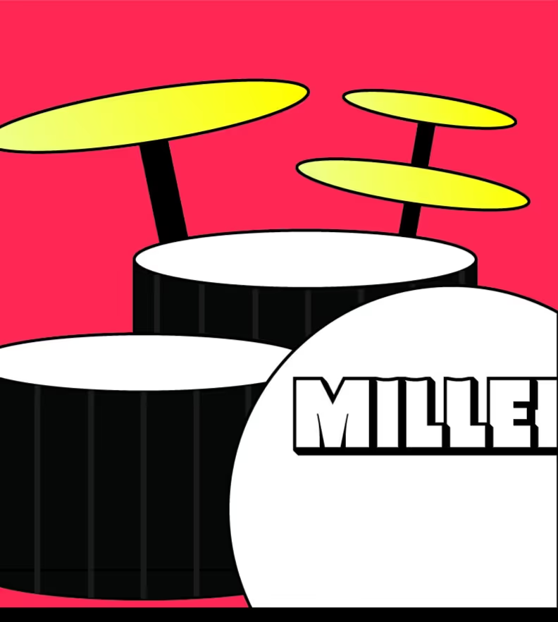
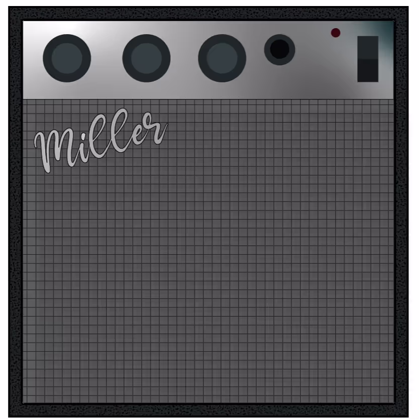
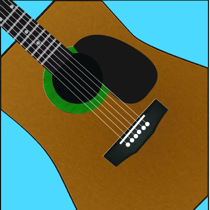
Sticker Project
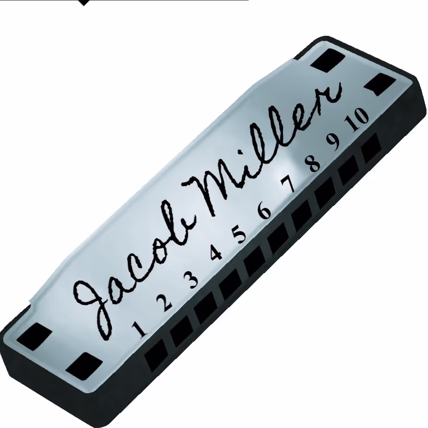
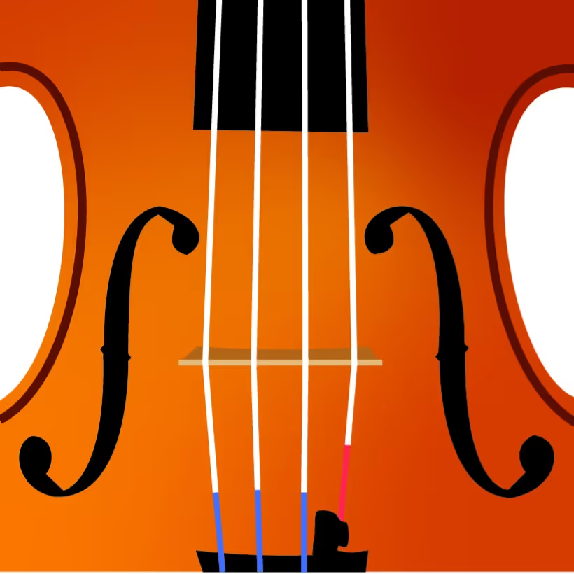
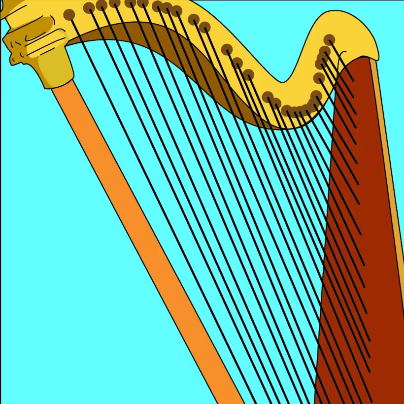
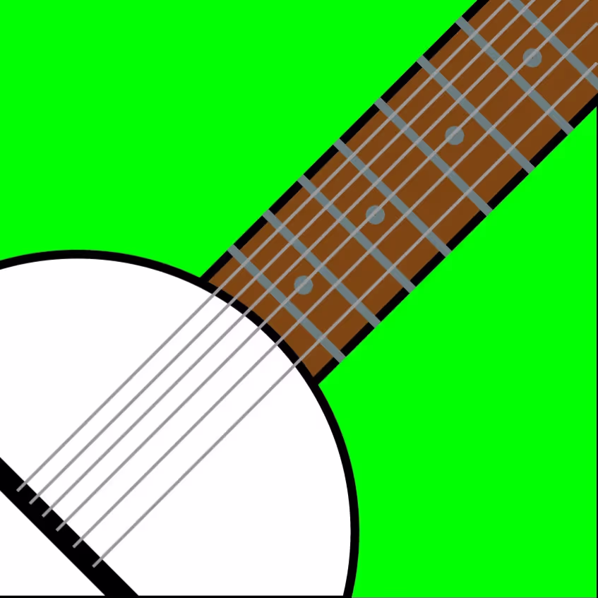
This project required me to create a minimum of two sets of nine sticker designs, both following a specific theme. I chose to use a Christian theme for my first set, and a musical instrument theme for my second set. I used reference images to get the basic shape of each sticker in my instrument set. I used Adobe Illustrator for these designs, utilizing the pen tool. For some of the stickers I implemented depth to illustrate the form of an animal, or of the instrument I chose. I also utilized a monochromatic color scheme for some of the stickers to not draw attention away from the general message of the sticker that I made. For most of the instrument stickers I added texture to them, to further indicate what each instrument is. I opted to create Christian stickers to express my faith with those who see my artwork, and made instrument stickers because of my passion for music. I think all the stickers turned out really good, although I feel like I could have done better with the instrument ones, as some of the textures I used look almost out of place for some of them.
Tool Used:
- Adobe Illustrator - Pen Tool & Text Tool


Independent Study Project #1: Shading Practice
For my first independent study project of the school year, I chose to draw a rose from a reference, only using a Wacom drawing tablet to draw and shade the rose. I created depth in this piece by creating a fake bokeh effect in the background, using different sized circular brushes, and blurring a pattern for the background, alongside the shadows added in the rose itself. The piece was created relatively in proper proportion. This was done by drawing in a ladybug flying near the flower. I drew this with the drawing tablet, as well as making the wings look realistic by making them slightly translucent using many blending layers. I also implemented texture into my piece by adding noise after finishing the drawing. I decided to draw a rose because I thought it would be a really good challenge for me, due to how complex a rose is. I think this project turned out exceptionally well, even with the imperfection of the middle of the rose.
Tools Used:
- Adobe Photoshop
- Wacom Drawing Tablet

Portrait Mosaic
This assignment tasked me to create a mosaic portrait of someone, using 100 photos of that person. I had my friend Gavin give me 100 photos of himself, and used a photo I got of him for the main subject of the portrait. I then made an 8x12 inch document with a resolution of 300, and made a contact sheet with all 100 photos. I then fine tuned each photo on the contact sheet, making sure they all align in a perfect grid. After this contact sheet was made, I used blending modes and adjustment layers in Photoshop to blend the photos with the main photo of my friend Gavin. I decided to make this project around my good friend Gavin because he is the only person I know who would have that many photos of himself, and because we have been close friends for most of our lives. I think this project turned out pretty good, I enjoy how I blended the photos of him into the one big photo of him.
Tool Used:
- Adobe Photoshop - Contact Sheet

T-Shirt Silk-screening Project
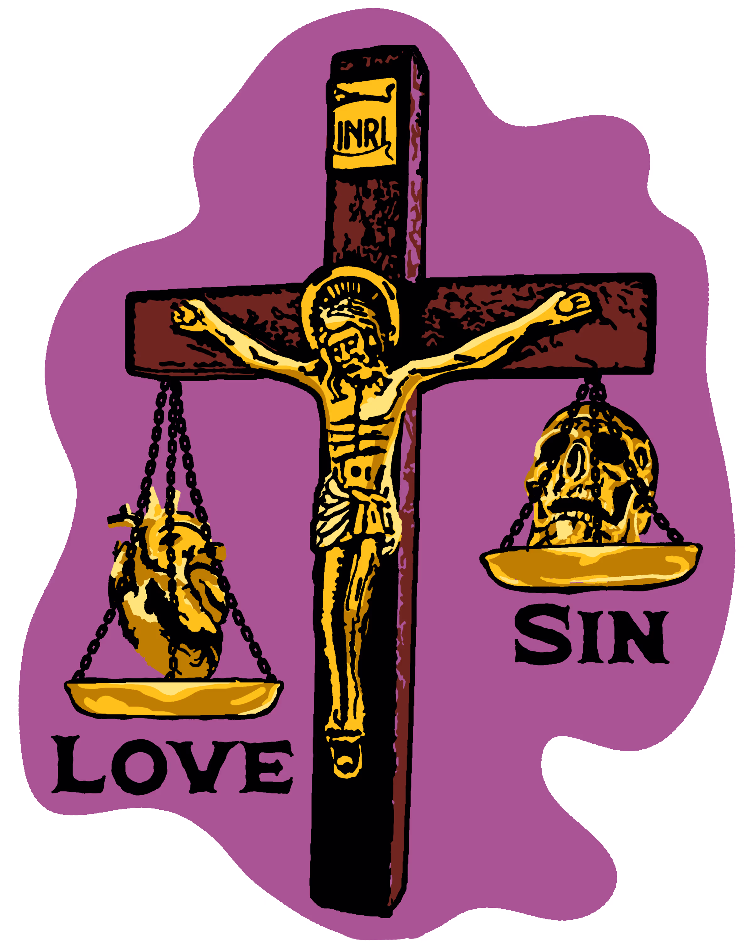
This project required us to create a T-Shirt design. I consulted my Dad on what I should make the design on, and he thought I should make a cross with judicial scales symbolizing how Jesus' love outweighs sin. I decided to use my grandma's crucifix for the cross and Jesus. This shirt means a lot to me now, being a way I can share my faith with others around me, but also because the crucifix I used to model the subject of this piece belonged to my grandma, who recently passed away. I utilized form to make the crucifix appear three-dimensional. I also utilized value to further emulate this look, and to make Jesus on the cross more visually appealing than just one flat color. Even though the crucifix was small, I made it appear to be big in my artwork utilizing proportion, also by adding the judicial scales behind the cross. To again make the piece more visually appealing I added texture, primarily in the black section of the piece, to try and make the brown part of the cross appear to be more like wood. I think this piece turned out better than I could have hoped for, even though I wanted to initially attempt to create a realistic image, I think it turned out much better stylized. I think I could have put it on the shirt itself much better, as most of the shirts are off in some way. I went really ambitious with this project, attempting to create a really detailed shirt design, but I feel like even though it was difficult to put onto every T-shirt, it turned out really well.
Tools Used:
- Adobe Photoshop
- Wacom Drawing Tablet
- Silk Screen
- Acrylic Paint
Back
Front
.avif)

Independent Study Project #2: Collage Landscape Practice.
For my second independent study project I decided to make a landscape by collaging many different photos together. I implemented space into this piece by finding photos of landscapes that were gradually farther away from the camera and merging them into one photo, and by utilizing the foreground through adding branches. I utilized movement in this piece through blurring the leaves in the foreground, to have it appear as if they were blowing in the wind. I also created balance in the piece by drawing the viewer's eye to the cross in the midground, and by making sure one side of the artwork was not more detailed than the other. I created this piece because ever since I was baptized, a similar image to this one was in my head, and I wanted to express this into artwork. I like to imagine this piece symbolizes that even if circumstances seem bleak, there is still beauty in everything around you. I think this turned out exceptionally well, I am really happy with how the full composition looks after applying a camera raw filter on it, and how I masked out the leaves in the foreground.
Tools Used:
- Unsplash.com
- Adobe Photoshop

John 3:16 NIV
For God so loved the world that he gave his one
and only Son, that whoever believes in him shall
not perish but have eternal life.
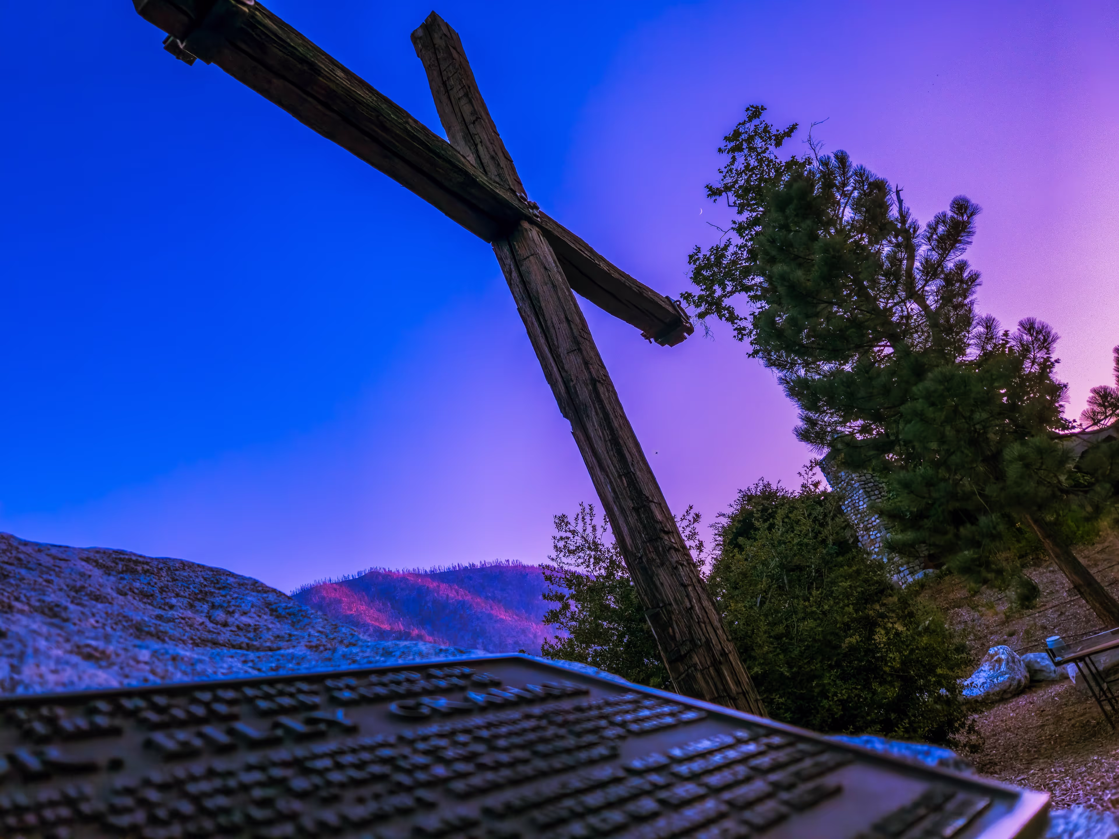
Forest Home Photography
John 3:16 (2nd Angle)
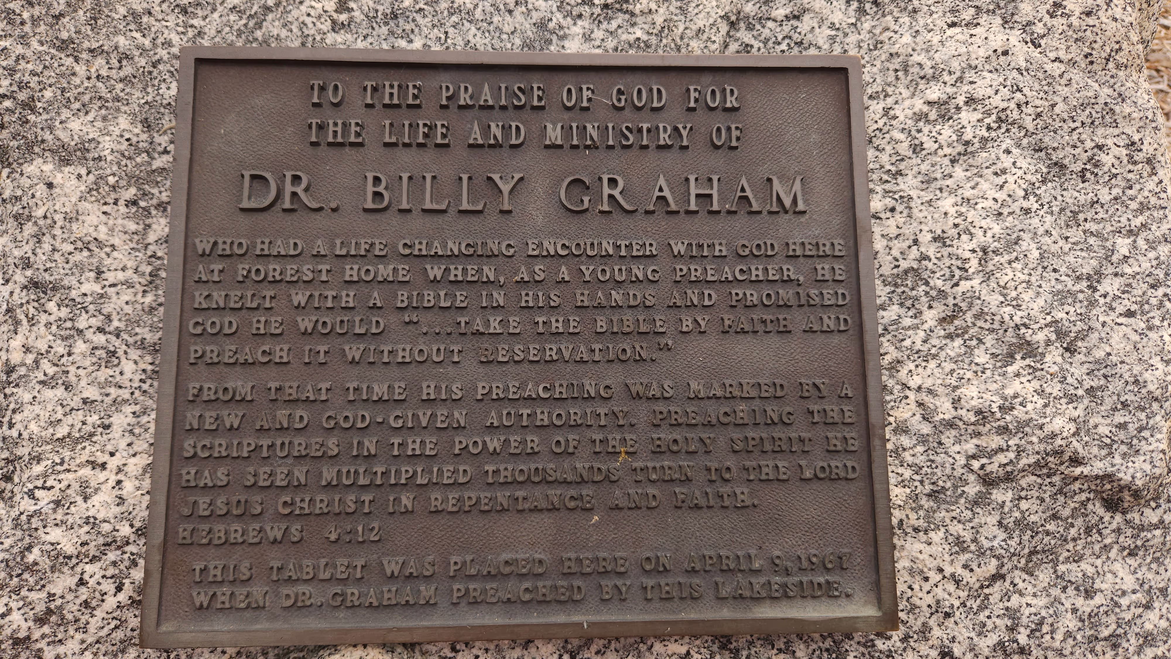
Both of these photos of Forest Home's Cross were taken to give me an oppritunity to share the gospel of Jesus Christ, which is why this piece is titled "John 3:16". The cross symbolizes the death of Jesus, which gave us salvation from our sins. The sunset painting beautiful hues of blue and purple are used to remind us of the beauty of Jesus' sacrifice, and the beauty of God's creation. The plaque out of focus is Dr. Billy Graham's memorial of his service for Christ (full plaque in 2nd photo below).
Tools Used:
- Adobe Photoshop Express
- Adobe Lightroom Mobile
- Samsung Galaxy S23 Front Facing Camera
Romans 10:9
At Forest Home's prayer trail, there are stones engraved with bible verses used to encourage those who walk along the path. Both this verse, and James 4:8 were photographed because they both perfectly describe God's love for everyone, and they were the only two I was able to get a good photo of.
Tools Used:
- Adobe Photoshop Express
- Adobe Lightroom Mobile
- Samsung Galaxy S23 Front Facing Camera
.avif)
James 4:8
.avif)
The Lord's Canvas | Inspiration Point: Forest Home - The Stars
At Forest Home summer camp 2024, I took multiple astro-photos, and was able to see God's beautiful night sky through the lens of my phone camera, seeing even more than anyone could see with the naked eye. The first photo was taken from the bridge connecting both sides of Forest Home, and the rest were taken up at Forest Home's Inspiration Point.
Tools Used:
- Adobe Photoshop Express
- Adobe Lightroom Mobile
- Samsung Galaxy S23 Front Facing Camera
.avif)
(1).avif)
.avif)
.avif)
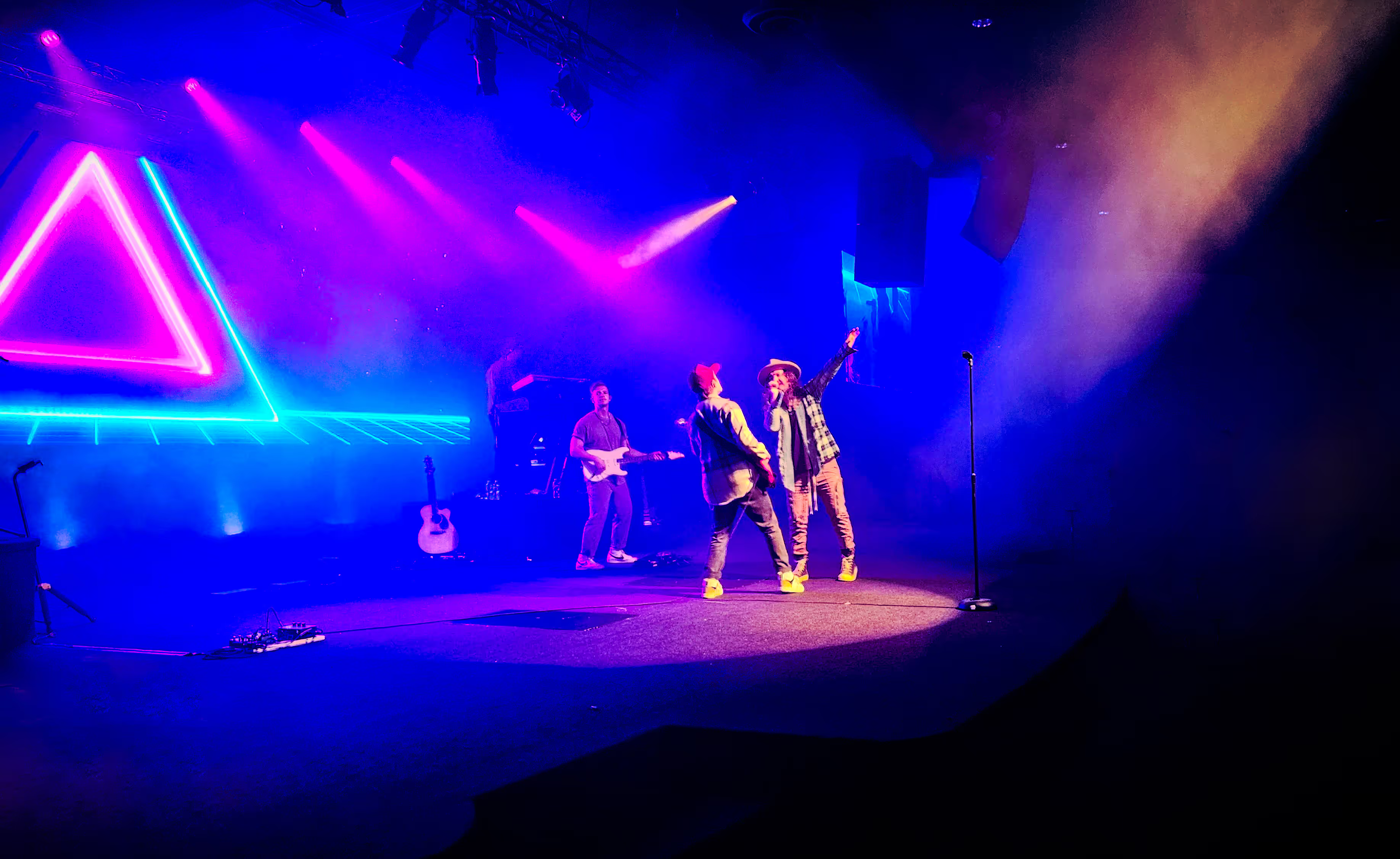
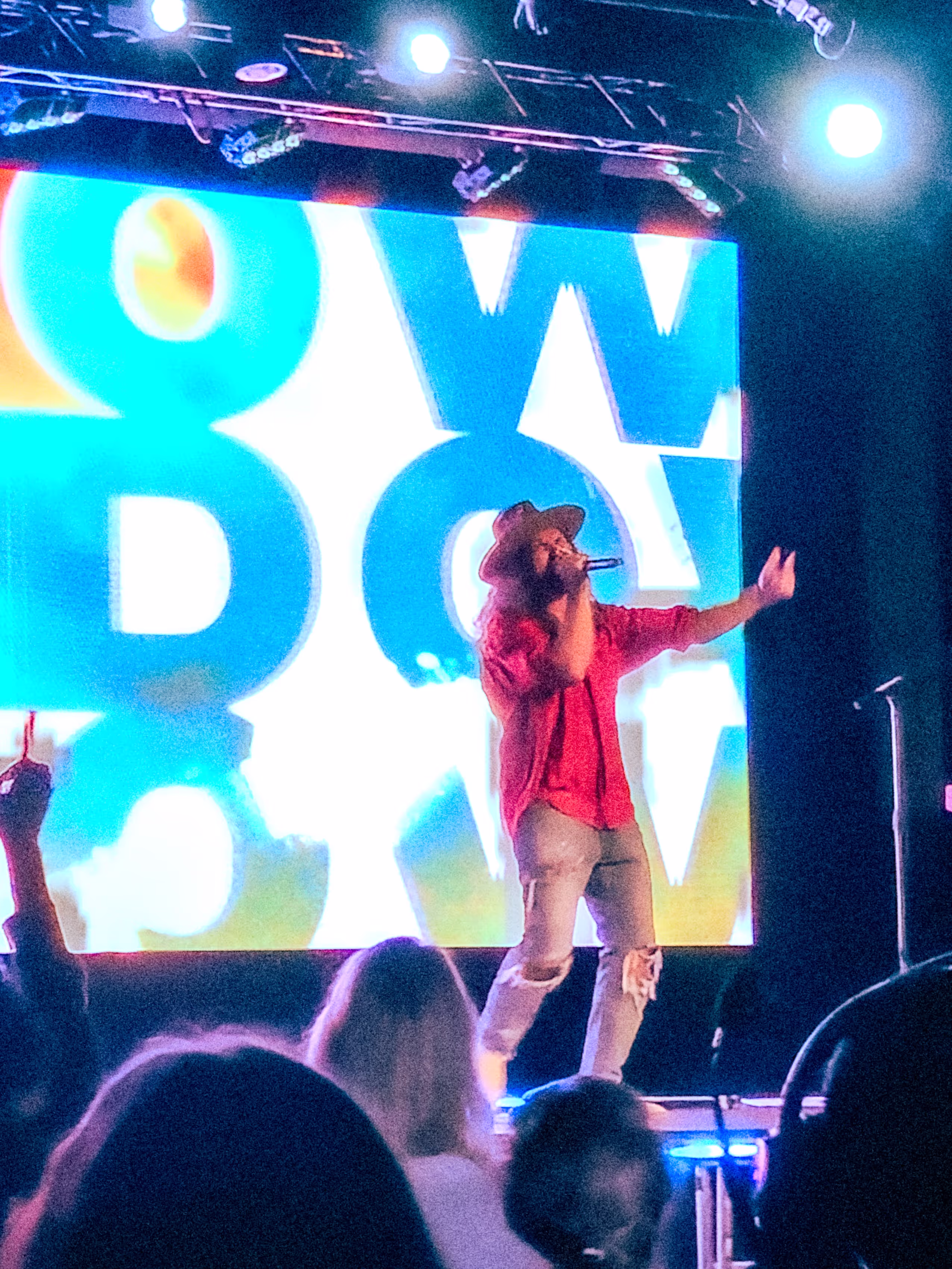
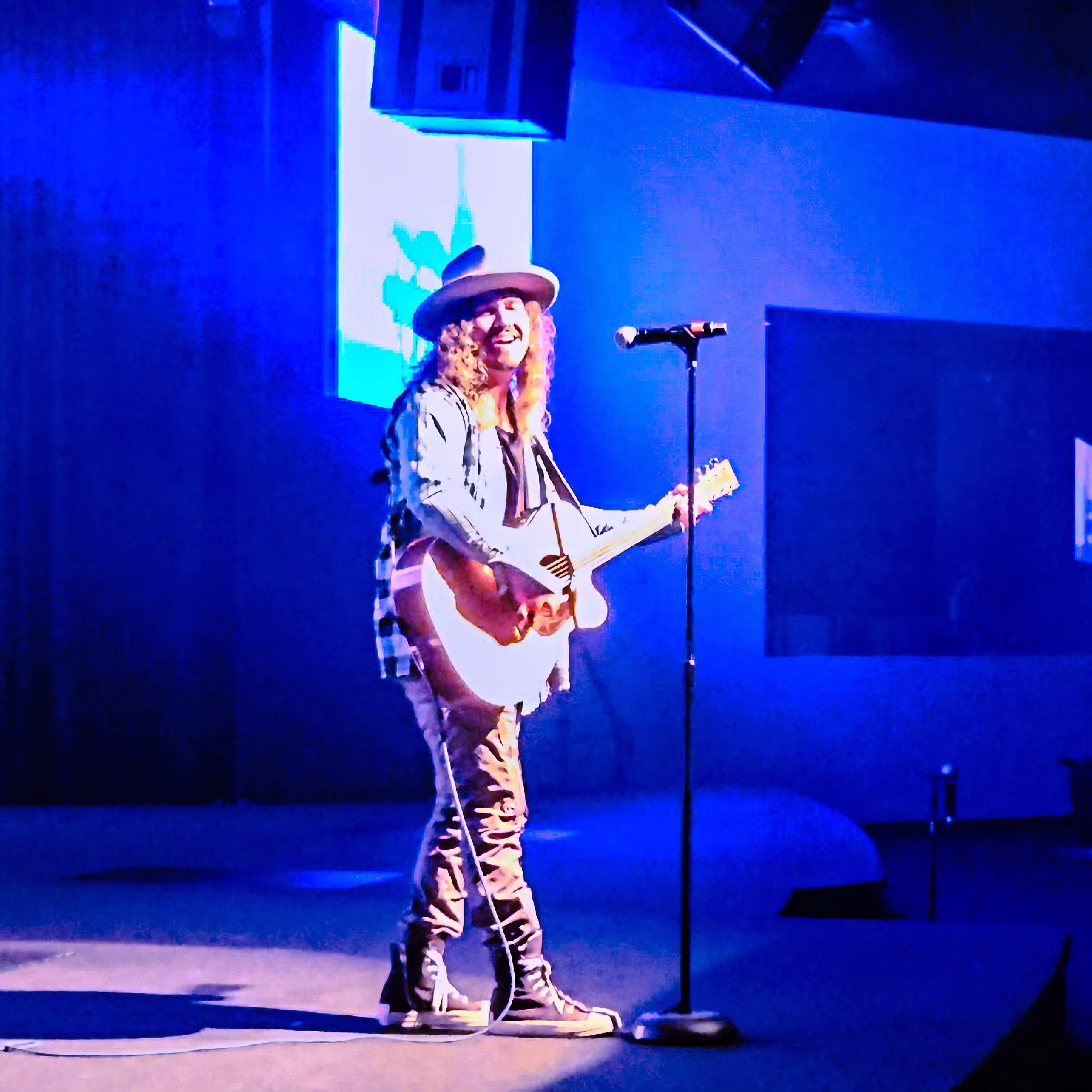
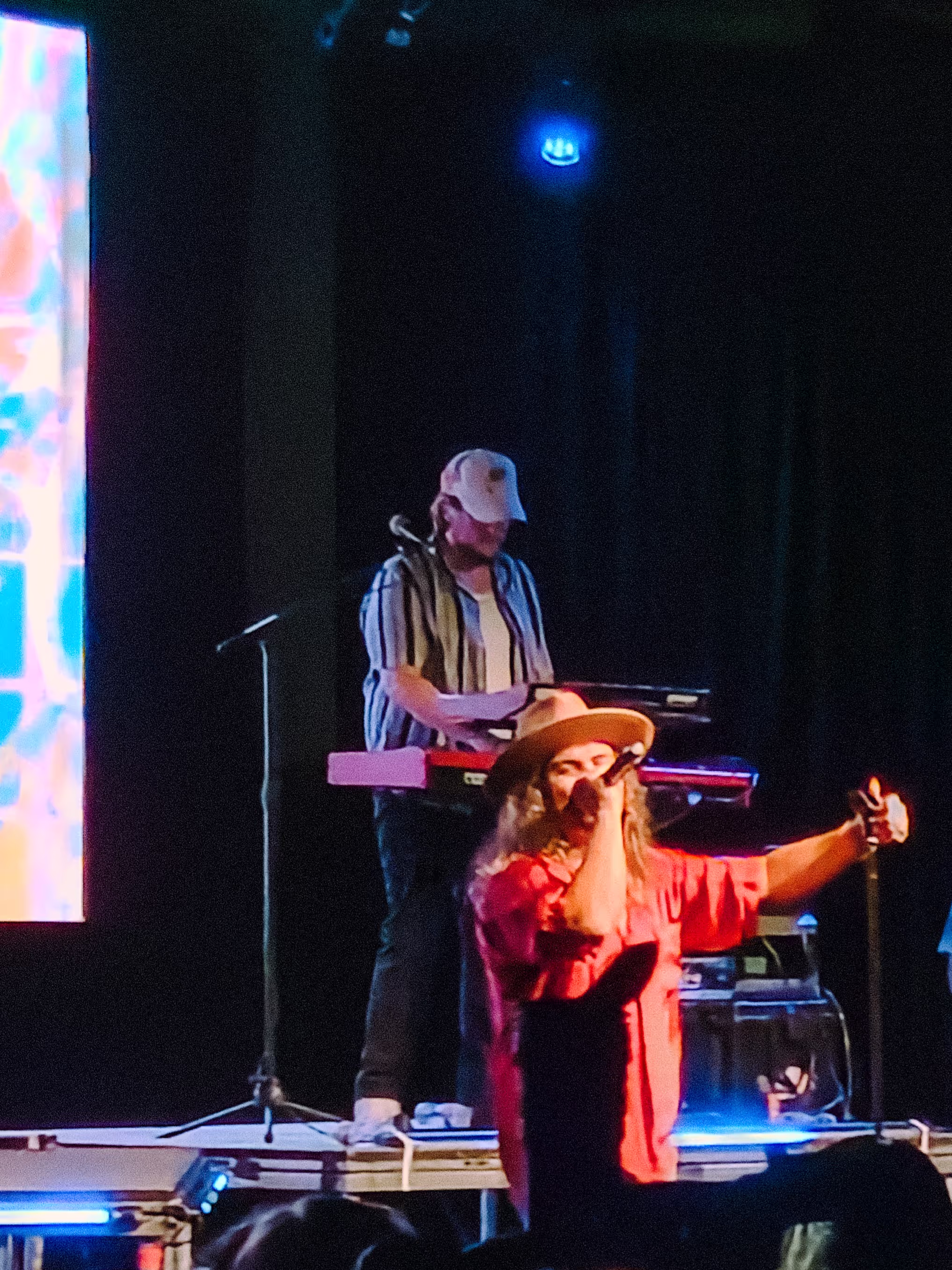
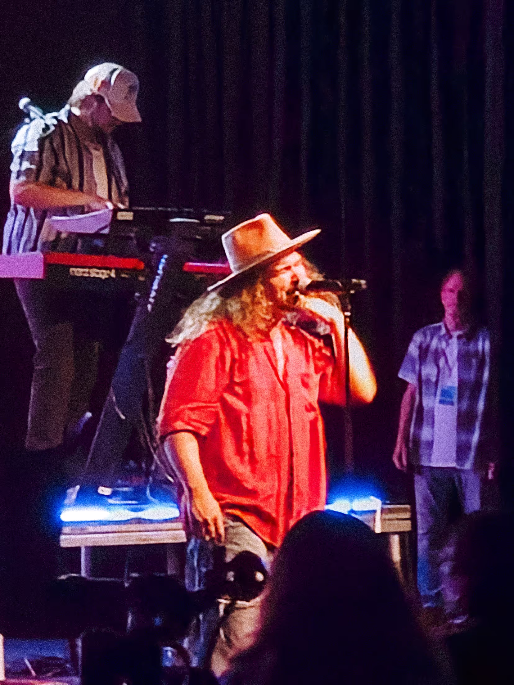
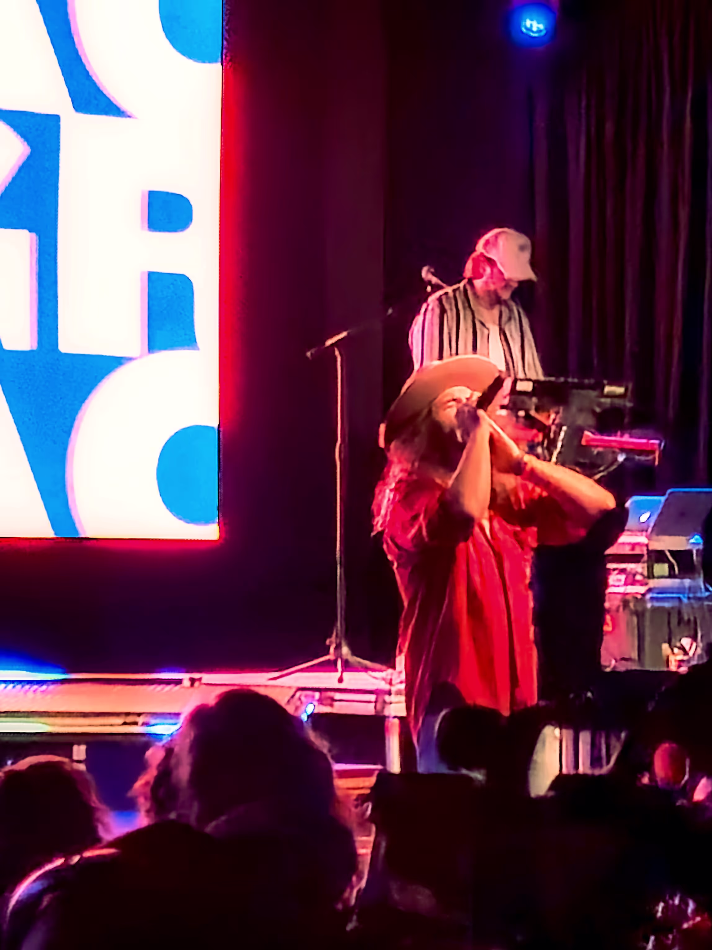
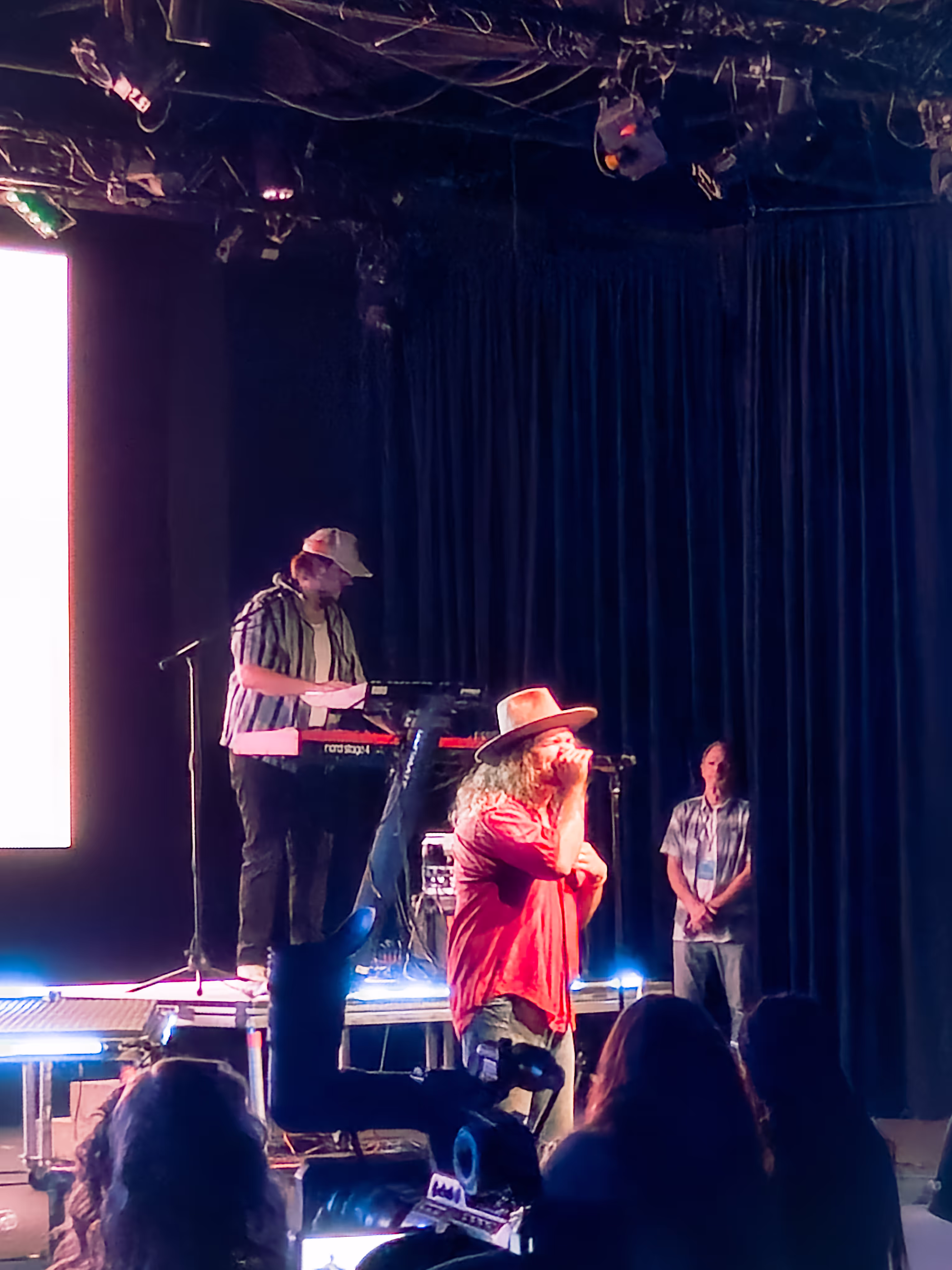
Jordan Feliz - In His Presence Church
Tools Used:
- Adobe Photoshop Express
- Adobe Lightroom Mobile
- Samsung Galaxy S23 Front Facing Camera
.avif)
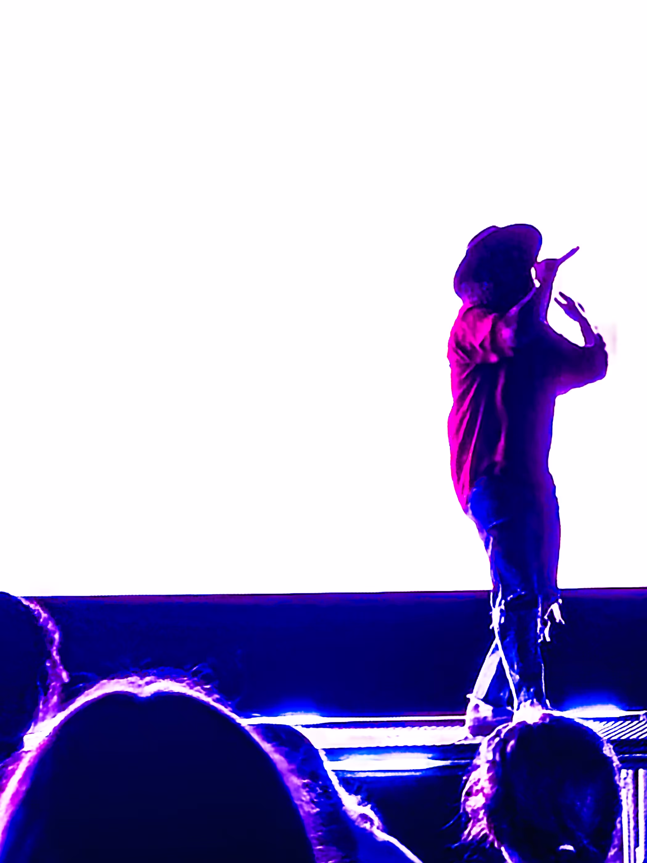
For Jesus' Glory
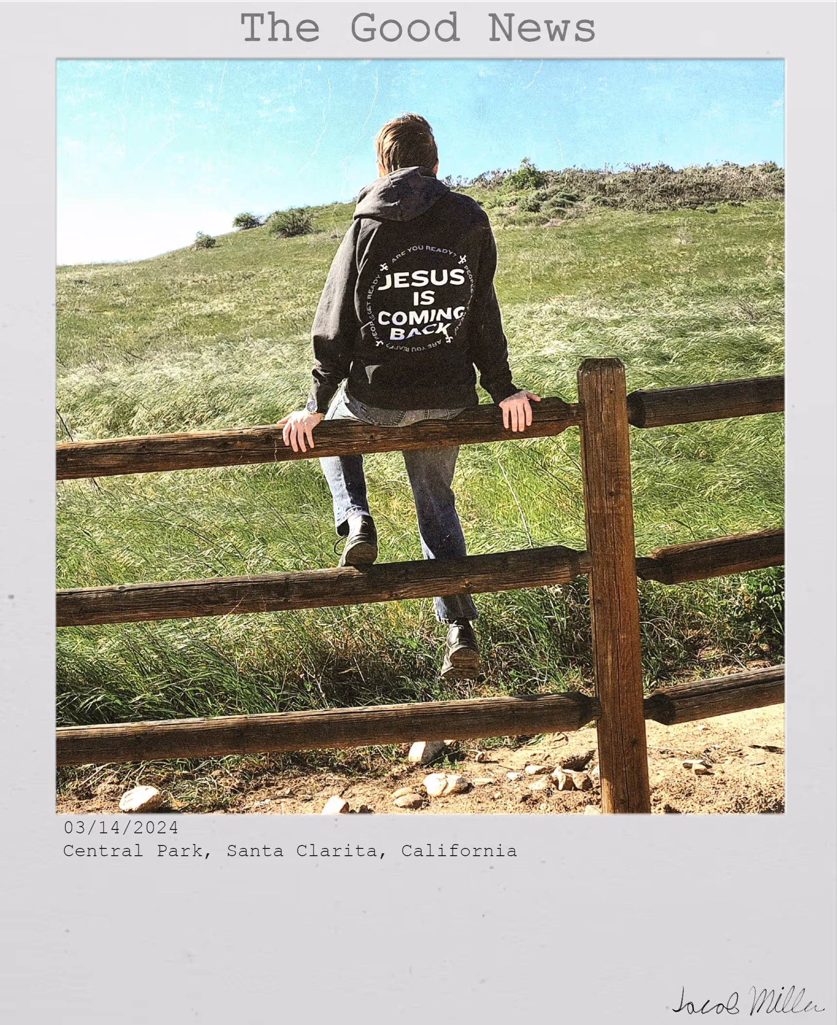
The Good News
I took this photo to express my freedom I have found in Christ Jesus, and wore Jordan Feliz's sweatshirt which reads "Jesus is Coming Back" to further prove the message.
Tools Used:
- Adobe Lightroom Mobile
- Clip Studio Paint Pro
- Samsung Galaxy S23 Front Facing Camera
- Pixlr Editor
Romans 5:8
In my third year of Digital Media Arts class, I was assigned to create a T-Shirt Design (also titled Romans 5:8 in Digital Arts Three "My Education" section). I chose to use Jesus on the cross as the subject of the picture, utilizing a little statue of Jesus on the cross for the photo. I hiked up to the top of the hill at Central Park during sunset to shoot this shot.
Tools Used:
- Adobe Photoshop Express
- Adobe Lightroom Mobile
- Samsung Galaxy S23 Front Facing Camera
.avif)
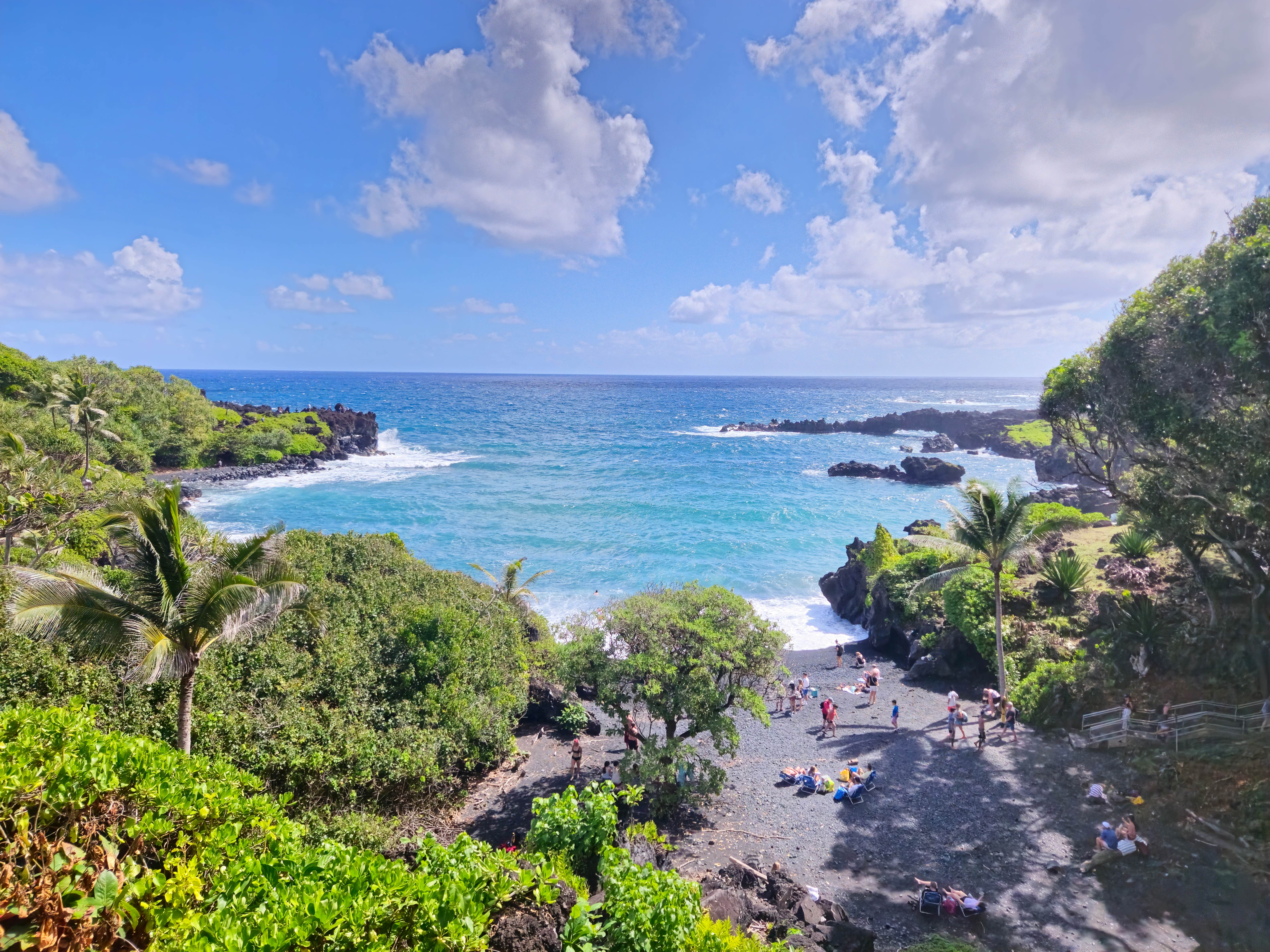
Maui (10/10/2024-10/17/2024)
Black Sand Beach